Informationisbeautiful.net, a project dedicated to turning data into beautiful visualizations with as few words as possible, recently posted a big, bright, and colorful look into the world's biggest data breaches. Below is part of the infographic/diagram. To see the whole thing, in all of its glory, click here.
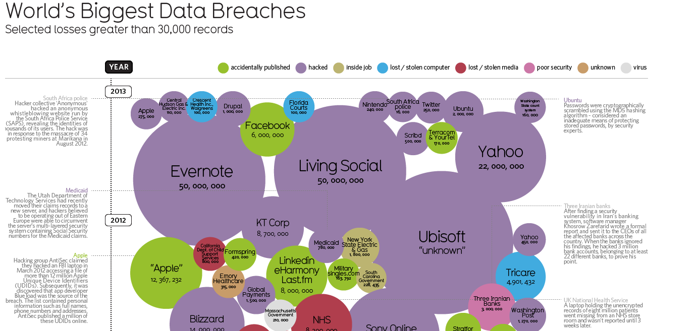
(Souce: informationisbeautiful.net)
But while it's one thing to gaze at a pretty infographic with awesome stats about company breaches, experiencing one at your company is something we here at Webroot hope you never have to go through. That's why we make it our mission to prevent these attacks, through some of the most advanced, always-up-to-date internet security solutions in the world.
What is interesting to note is that in general, the average size of the breaches does seem to slowly go down over time. However, as the size of the average breach on the chart is doing down, the number of breaches per year is going way up.. and the total number of people affected up as well.
Reply
Login to the community
No account yet? Create an account
Enter your username or e-mail address. We'll send you an e-mail with instructions to reset your password.